

Introduction
Joblly Admin is a popular open source WebApp template for admin dashboards and control panels. It is a responsive HTML template that is based on the CSS framework Bootstrap 4 It utilizes all of the Bootstrap components in its design and re-styles many commonly used plugins to create a consistent design that can be used as a user interface for backend applications. Joblly Admin is based on a modular design, which allows it to be easily customized and built upon. This documentation will guide you through installing the template and exploring the various components that are bundled with the template.
Installation Guide
First of all, choose you desire folder & copy that folder and also copy that assets folder.
example : Joblly Admin + assets (Required) = Enjoy your demo.
Note!
Template Sass(scss) file only for {color_theme.css, skin_color.css, style.css, style_rtl.css} include. Template Sass(scss) File source in (Sass folder)Other Third party plugins Sass File not include. You can Find Third party plugins Sass file from plugins website.
Dependencies & Plugins
Dependencies
Joblly Admin depends on two main frameworks. The downloadable package contains both of these libraries, so you don't have to manually download them.
Plugins
Joblly Admin makes use of the following plugins. For documentation, updates or license information, please visit the provided links.
Editors
- Bootstrap WYSIHTML5
- CK Editor
- ACE Editor
Layout (HTML)
The layout consists of four major parts:
- Wrapper
.wrapper. A div that wraps the whole site. - Main Header
.main-header. Contains the logo and navbar. - Sidebar
.sidebar-wrapper. Contains the user panel and sidebar menu. - Content
.content-wrapper. Contains the page header and content.
Layout Options
Note!
You cannot use both layout-boxed and fixed at the same time. Anything else can be mixed together.
Joblly Admin provides a set of options to apply to your main layout. Each one of these classes can be added to the body tag to get the desired goal.
- Fixed: use the class
.fixedto get a fixed header and sidebar. - Collapsed Sidebar: use the class
.sidebar-collapseto have a collapsed sidebar upon loading. - Boxed Layout: use the class
.layout-boxedto get a boxed layout that stretches only to 1250px.
Skins
Skins can be found in the css/skins folder.
Choose the skin file that you want and then add the appropriate
class to the body tag to change the template's appearance. Here is the list of available skins:
| Skin Class | Preview | Skin Class | Preview | Skin Class | Preview |
|---|---|---|---|---|---|
theme-primary |
theme-Warning |
theme-Danger |
|||
theme-success |
theme-info |
theme-secondary |
RTL Ready
RTL Version
File Location:css/master_style_rtl.css
nots:For RTL Demo add Class in body tagclass:rtl
Dark Version Ready
Dark Version
File Location:css/master_style_dark.css
nots:For DARK Demo add Class in body tagclass:dark-skin
Main Header (HTML)
The main header contains the logo and navbar. Construction of the navbar differs slightly from Bootstrap because it has components that Bootstrap doesn't provide. The navbar can be constructed in two ways. This is an example for the normal navbar.
Below code is used at the main header of all HTML pages

<header class="main-header">
	<div class="d-flex align-items-center logo-box justify-content-start">
		<a href="#" class="waves-effect waves-light nav-link d-none d-md-inline-block mx-10 push-btn bg-transparent" data-toggle="push-menu" role="button">
			<i data-feather="menu"></i>
		</a>
		<!-- Logo -->
		<a href="index.html" class="logo">
		  <!-- logo-->
		  <div class="logo-lg">
			  <span class="light-logo"><img src="../images/logo-dark-text.png" alt="logo"></span>
			  <span class="dark-logo"><img src="../images/logo-light-text.png" alt="logo"></span>
		  </div>
		</a>
	</div>
    <!-- Header Navbar -->
    <nav class="navbar navbar-static-top">
      <!-- Sidebar toggle button-->
	  <div class="app-menu">
		<ul class="header-megamenu nav">
			<li class="btn-group nav-item d-md-none">
				<a href="#" class="waves-effect waves-light nav-link push-btn" data-toggle="push-menu" role="button">
					<i data-feather="menu"></i>
			    </a>
			</li>
		</ul>
	  </div>

      <div class="navbar-custom-menu r-side">
        <ul class="nav navbar-nav">
		  <li class="btn-group nav-item d-lg-flex d-none align-items-center">
			<p class="mb-0 text-fade pr-10 pt-5">Friday, 4th December 2020</p>
		  </li>
		  <li class="btn-group nav-item d-lg-inline-flex d-none">
			<a href="#" data-provide="fullscreen" class="waves-effect waves-light nav-link full-screen" title="Full Screen">
				<i data-feather="maximize"></i>
			</a>
		  </li>
          <!-- Control Sidebar Toggle Button -->
		  <li class="btn-group nav-item d-inline-flex">
			<a href="#" data-toggle="control-sidebar" class="waves-effect waves-light nav-link full-screen" title="Setting">
				<i data-feather="settings"></i>
			</a>
		  </li>
		  <!-- Notifications -->
		  <li class="dropdown notifications-menu">
			<a href="#" class="waves-effect waves-light dropdown-toggle" data-toggle="dropdown" title="Notifications">
			  <i data-feather="bell"></i>
			</a>
			<ul class="dropdown-menu animated bounceIn">

			  <li class="header">
				<div class="p-20">
					<div class="flexbox">
						<div>
							<h4 class="mb-0 mt-0">Notifications</h4>
						</div>
						<div>
							<a href="#" class="text-danger">Clear All</a>
						</div>
					</div>
				</div>
			  </li>

			  <li>
				<!-- inner menu: contains the actual data -->
				<ul class="menu sm-scrol">
				  <li>
					<a href="#">
					  <i class="fa fa-users text-info"></i> Curabitur id eros quis nunc suscipit blandit.
					</a>
				  </li>
				  <li>
					<a href="#">
					  <i class="fa fa-warning text-warning"></i> Duis malesuada justo eu sapien elementum, in semper diam posuere.
					</a>
				  </li>
				  <li>
					<a href="#">
					  <i class="fa fa-users text-danger"></i> Donec at nisi sit amet tortor commodo porttitor pretium a erat.
					</a>
				  </li>
				  <li>
					<a href="#">
					  <i class="fa fa-shopping-cart text-success"></i> In gravida mauris et nisi
					</a>
				  </li>
				  <li>
					<a href="#">
					  <i class="fa fa-user text-danger"></i> Praesent eu lacus in libero dictum fermentum.
					</a>
				  </li>
				  <li>
					<a href="#">
					  <i class="fa fa-user text-primary"></i> Nunc fringilla lorem
					</a>
				  </li>
				  <li>
					<a href="#">
					  <i class="fa fa-user text-success"></i> Nullam euismod dolor ut quam interdum, at scelerisque ipsum imperdiet.
					</a>
				  </li>
				</ul>
			  </li>
			  <li class="footer">
				  <a href="#">View all</a>
			  </li>
			</ul>
		  </li>
		  <!-- User Account-->
          <li class="dropdown user user-menu">
            <a href="#" class="waves-effect waves-light dropdown-toggle" data-toggle="dropdown" title="User">
				<i class="icon-User"><span class="path1"></span><span class="path2"></span></i>
            </a>
            <ul class="dropdown-menu animated flipInX">
              <li class="user-body">
				 <a class="dropdown-item" href="#"><i class="ti-user text-muted mr-2"></i> Profile</a>
				 <a class="dropdown-item" href="#"><i class="ti-wallet text-muted mr-2"></i> My Wallet</a>
				 <a class="dropdown-item" href="#"><i class="ti-settings text-muted mr-2"></i> Settings</a>
				 <div class="dropdown-divider"></div>
				 <a class="dropdown-item" href="#"><i class="ti-lock text-muted mr-2"></i> Logout</a>
              </li>
            </ul>
          </li>
        </ul>
      </div>
    </nav>
  </header>
Control Sidebar (HTML)
Control sidebar is the right side bar. It can be used for many purposes and is extremely easy to create. The sidebar ships with two different show/hide styles. The first allows the sidebar to slide over the content. The second pushes the content to make space for the sidebar. Either of these methods can be set through the Javascript options.
The following code should be placed within the .wrapper div. I prefer to place it right after the footer.
Below code is used at the Right sidebar (Dark Markup) of all HTML pages
		<!-- The Right Sidebar -->
		<aside class="control-sidebar control-sidebar-dark">
		  <!-- Content of the sidebar goes here -->
		</aside>
		<!-- The sidebar's background -->
		<!-- This div must placed right after the sidebar for it to work-->
		<div class="control-sidebar-bg"></div>
Once you create the sidebar, you will need a toggle button to open/close it.
By adding the attribute data-toggle="control-sidebar" to any button, it will
automatically act as the toggle button.
Below code is used at the Right sidebar (Light Markup) of all HTML pages
		<!-- The Right Sidebar -->
		<aside class="control-sidebar control-sidebar-light">
		  <!-- Content of the sidebar goes here -->
		</aside>
		<!-- The sidebar's background -->
		<!-- This div must placed right after the sidebar for it to work-->
		<div class="control-sidebar-bg"></div>
Once you create the sidebar, you will need a toggle button to open/close it.
By adding the attribute data-toggle="control-sidebar" to any button, it will
automatically act as the toggle button.
Sidebar Toggle Markup
		<a href="#" data-toggle="control-sidebar" title="Setting"><i class="fa fa-cog fa-spin"></i></a>

		<div class="rpanel-title"><span class="pull-right btn btn-circle btn-danger"><i class="ion ion-close text-white" data-toggle="control-sidebar"></i></span> </div>
Box Component (HTML)
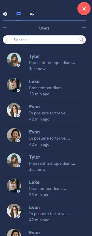
The box component is the most widely used component through out this template. You can use it for anything from displaying charts to just blocks of text.
Below code is used at the box component of all HTML pages
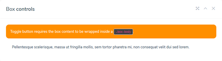
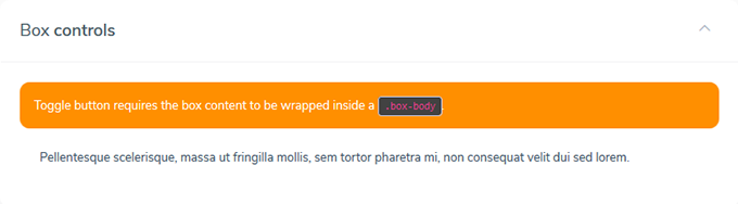
<div class="box">
  <div class="box-header with-border">
	<h4 class="box-title">Box <strong>slided up</strong></h4>
	<ul class="box-controls pull-right">
	  <li><a class="box-btn-close" href="#"></a></li>
	  <li><a class="box-btn-slide" href="#"></a></li>
	  <li><a class="box-btn-fullscreen" href="#"></a></li>
	</ul>
  </div>

  <div class="box-body">
	<div class="callout callout-warning mb-0" role="alert">
	  Toggle button requires the box body to be wrapped inside a <code>.box-body</code>.
	</div>
	<div class="box-body">
	  <p>Ut vestibulum enim vitae elit luctus, id tincidunt metus suscipit. Pellentesque scelerisque, massa ut fringilla mollis, sem tortor pharetra mi, non consequat velit dui sed lorem.</p>
	</div>
  </div>
</div>
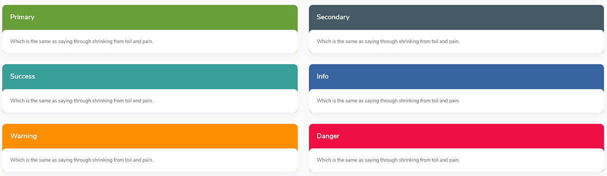
Box controls
Boxes can contain tools to deploy a specific event or provide simple info. The following examples makes use of multiple Joblly Admin components within the header of the box.
<div class="box">
  <div class="box-header with-border">
	<h4 class="box-title">Box <strong>slided up</strong></h4>
	<ul class="box-controls pull-right">
	  <li><a class="box-btn-close" href="#"></a></li>
	  <li><a class="box-btn-slide" href="#"></a></li>
	  <li><a class="box-btn-fullscreen" href="#"></a></li>
	</ul>
  </div>
</div>
Solid Box
Solid Boxes are alternative ways to display boxes. They can be created by simply adding the box-solid class to the box component. You may also use contextual classes with you solid boxes.
<div class="box box-solid bg-dark">...</div>
<div class="box box-solid bg-primary">...</div>
<div class="box box-solid bg-info">...</div>
<div class="box box-solid bg-warning">...</div>
<div class="box box-solid bg-success">...</div>
<div class="box box-solid bg-danger">...</div>
Layout Plugin (JavaScript)
The layout plugin manages the layout in case of css failure to reset the height or width of the content.
Usage
This plugin is activated automatically upon window load.
Options
| Name | Type | Default | Description |
|---|---|---|---|
| slimscroll | Boolean | TRUE | Whether to activate slimScroll for the sidebar. |
| resetHeight | Boolean | TRUE | Whether to reset height of the body to auto. You'd set this false if your main content div is scrollable rather than the body. |
Methods
| Method | Description |
|---|---|
| fix | Fix the content part of the page. |
| fixSidebar | Fix the sidebar part of the page. |
Example: $('body').layout('fix')
Tree Plugin (JavaScript)
The tree plugin converts a nested list into a tree view where sub menus can be expanded.
Usage
This plugin can be activated using the data-api or jQuery.
Data API
Add data-widget="tree" to any ul or ol element to activate the plugin.
All options can be passed using the data api. Example: data-animation-speed="1000".
<ul class="sidebar-menu" data-widget="tree">

		<li>
          <a href="charts_chartjs.html">
            <i class="ti-stats-up"></i>
			<span>ChartJS</span>
          </a>
        </li>

        <li class="treeview">
          <a href="#">
            <i class="ti-view-list"></i>
			<span>Multilevel</span>
            <span class="pull-right-container">
              <i class="fa fa-angle-right pull-right"></i>
            </span>
          </a>
          <ul class="treeview-menu">
            <li><a href="#">Level One</a></li>
            <li class="treeview">
              <a href="#">Level One
                <span class="pull-right-container">
              <i class="fa fa-angle-right pull-right"></i>
            </span>
              </a>
              <ul class="treeview-menu">
                <li><a href="#">Level Two</a></li>
                <li class="treeview">
                  <a href="#">Level Two
                    <span class="pull-right-container">
              <i class="fa fa-angle-right pull-right"></i>
            </span>
                  </a>
                  <ul class="treeview-menu">
                    <li><a href="#">Level Three</a></li>
                    <li><a href="#">Level Three</a></li>
                  </ul>
                </li>
              </ul>
            </li>
            <li><a href="#">Level One</a></li>
          </ul>
        </li>

      </ul>
JQuery
$('ul').tree(options)
Options
| Name | Type | Default | Description |
|---|---|---|---|
| animationSpeed | Number | 500 | Speed of slide down/up animation in milliseconds. |
| accordion | Boolean | TRUE | Whether to collapse the open menu when expanding another. |
| followLink | Boolean | FALSE | Whether to follow the link in the a element instead of expanding the sub menu. |
| trigger | String | .treeview a |
Selector of the element that should respond to the click and result in expanding or collapsing it sibling sub menu. |
Events
| Name | Description |
|---|---|
| expanded.tree | Triggered after a sub menu expands. |
| collapsed.tree | Triggered after a sub menu collapses. |
Example: $('ul').on('expanded.tree', handleExpandedEvent)
Control Sidebar Plugin (JavaScript)
The control sidebar component is part of Joblly Admin layout as the right sidebar.
Usage
This plugin can be activated using the data-api or jQuery. To activate the plugin, you must first add the HTML markup to your layout, then create the toggle button as shown below.
HTML Markup
		<!-- Control Sidebar -->
		<aside class="control-sidebar control-sidebar-dark">
		  <!-- Content of control sidebar goes here -->
		</aside>
		<!-- /.control-sidebar -->
		<!-- Add the sidebar's background. This div must be placed
		  immediately after the control sidebar -->
		<div class="control-sidebar-bg"></div>
Data API
Add data-toggle="control-sidebar" to any button or
a element to activate the plugin.
All options can be passed using the data api. Example: data-slide="false".
HTML Markup
<a href="#" data-toggle="control-sidebar">Toggle Control Sidebar</a>
JQuery
You can also activate the toggle button using jQuery by running the following example.
$("#my-toggle-button").controlSidebar(options);
Options
| Name | Type | Default | Description |
|---|---|---|---|
| Slide | Boolean | true | Whether the sidebar should slide over the content or push the content to make space for itself. |
Events
| Name | Description |
|---|---|
| expanded.controlsidebar | Triggered after the control sidebar is expanded. |
| collapsed.controlsidebar | Triggered after the control sidebar is collapsed. |
Example: $('#toggle-button').on('expanded.controlsidebar', handleExpandedEvent)
Box Widget Plugin (JavaScript)
The box widget plugin provides the functionality for collapsing, expanding and removing a box.
Usage
This plugin can be activated using the data-api or jQuery.
Data API
This plugin provides two data-api attributes. Any element using one of the
following attributes must be placed within the .box-controls div, which
is usually in the box header.
.box-btn-slide
This attribute, when attached to a button, allows the box to be collapsed/expanded when clicked.
HTML Markup
<div class="box">
  <div class="box-header with-border">
	<h4 class="box-title">Box <strong>slided up</strong></h4>
	<ul class="box-controls pull-right">
	  <li><a class="box-btn-slide" href="#"></a></li>
	</ul>
  </div>

  <div class="box-body">
	<div class="callout callout-warning mb-0" role="alert">
	  Toggle button requires the box body to be wrapped inside a <code>.box-body</code>.
	</div>
	<div class="box-body">
	  <p>Ut vestibulum enim vitae elit luctus, id tincidunt metus suscipit. Pellentesque scelerisque, massa ut fringilla mollis, sem tortor pharetra mi, non consequat velit dui sed lorem.</p>
	</div>
  </div>
</div>
box-btn-close
This attribute, when attached to a button, allows the box to be removed when clicked.

HTML Markup
<div class="box">
  <div class="box-header with-border">
	<h4 class="box-title">Box <strong>slided up</strong></h4>
	<ul class="box-controls pull-right">
	  <li><a class="box-btn-close" href="#"></a></li>
	</ul>
  </div>

  <div class="box-body">
	<div class="callout callout-warning mb-0" role="alert">
	  Toggle button requires the box body to be wrapped inside a <code>.box-body</code>.
	</div>
	<div class="box-body">
	  <p>Ut vestibulum enim vitae elit luctus, id tincidunt metus suscipit. Pellentesque scelerisque, massa ut fringilla mollis, sem tortor pharetra mi, non consequat velit dui sed lorem.</p>
	</div>
  </div>
</div>
Browser Support
Note!
IE10 does not support transitions or animations. The template will function properly but it won't use animations/transitions on IE10.
Joblly Admin supports the following browsers:
- IE11+
- Edge (latest)
- Firefox (latest)
- Safari (latest)
- Chrome (latest)
- Opera (latest)
Creadits
- Bootstrap
- Jquery
- Font-Awesome
- ionicons
- ChartJS
- Flot
- Morris.js
- Sparkline
- Bootstrap Slider
- Ion Slider
- Date Picker
- Date Range Picker
- Color Picker
- Time Picker
- iCheck
- Input Mask
- Bootstrap WYSIHTML5
- CK Editor
- DataTables
- Full Calendar
- jQuery UI
- jQuery Knob
- jVector Map
- Slim Scroll
- Pace
- Bootstrap-timepicker
- Bootstrap Colorpicker
- Select2
- Pexels (images)
- Weather Icons
- Magnific Popup
- lightbox master
- Sweetalert
- ACE Editor
- Form Validation
- Form Wizard
Support
If you need any help or feel any query don't hasitate just mail me (with licence key) on hello@multipurposethemes.com, i would love to help you, Once again thanks for purchasing the Joblly Admin template, i hope you enjoy it. Thanks